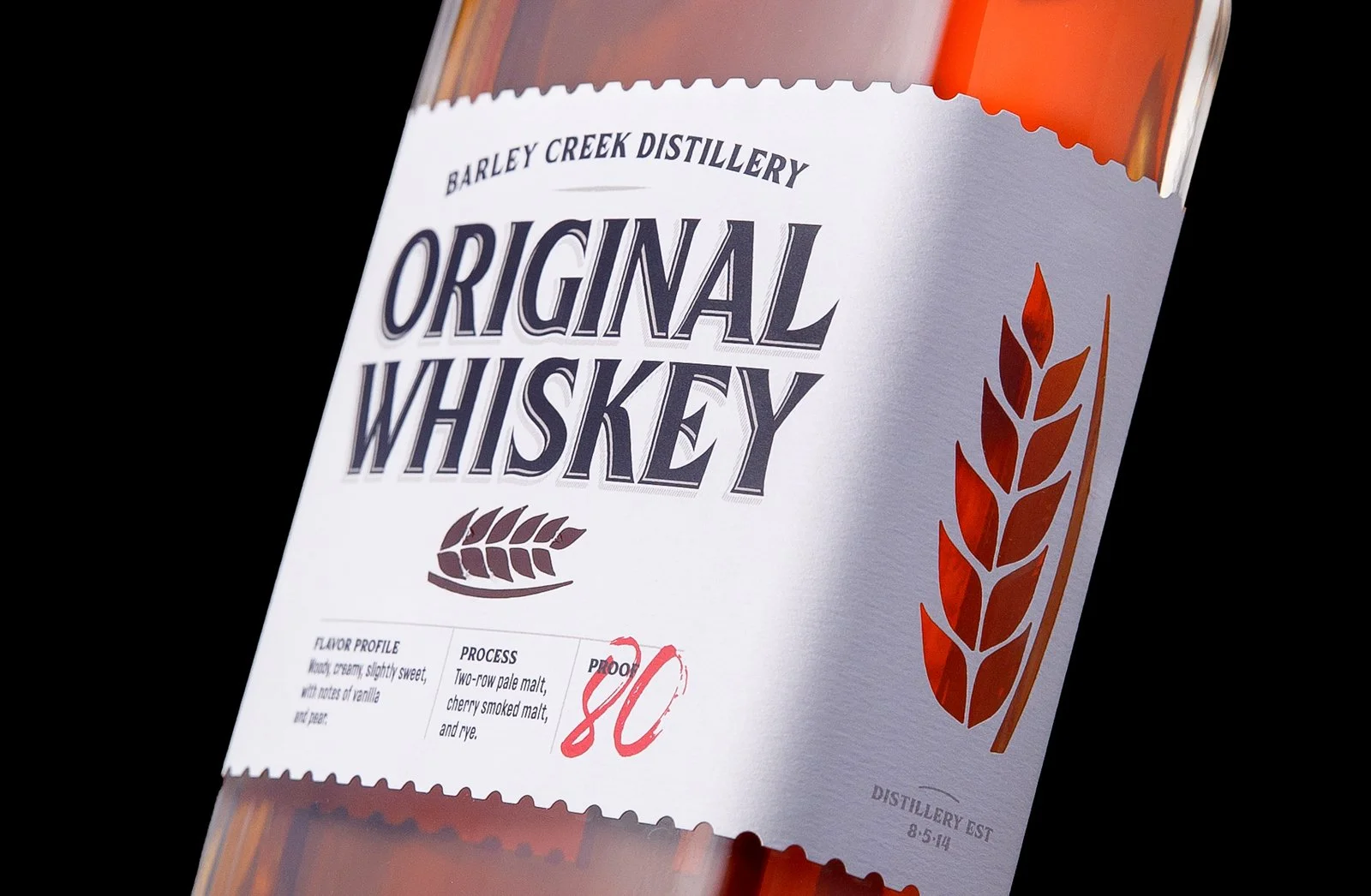
Barley Creek Whiskey Label Design
The team at Barley Creek Brewing Company approached Fat Basset Design asking if we could redesign the packaging for their whiskey line. The goal of the refreshed creative was to develop a brand block for their entire whiskey line up - which consisted of 7 flavors - that appealed to tourists coming in from NYC, New Jersey, and Philadelphia, while also being a proud gift for locals to give when visiting friends.
To accomplish this goal, we set up a series of touch points that needed to be achieved which included being recognizable and visually appealing, while also developing a system versatile enough to handle a variety of unforeseen styles.
Objectives:
• Create versatility
• Black & White vintage and industrious
• Crisp, clean, simple look
Target Market:
Vacationers from the New York, New Jersey and Philadelphia areas
Locals to the Pocono Mountains
There are a number of elements within the creative that solve for the above touch-points. A couple to note are the postage stamp border to reflect tourism and the abundance of balanced negative space highlighted by the red proof text. That latter of which was developed to bring out the color of the liquid seen through the Barley Creek icon shaped window on the front and sides of the bottle.
This was on of those opportunities where less was more, and by using a few simple elements balanced appropriately, we were able to accomplish the overall objective. And with the help of Resource Label Group, we were able to bring these labels to life!
As always we hope you enjoy the creative but the whiskey is WAY better, so if you’re in the Tannersville, PA area swing by Barley Creek to enjoy all they have to offer.
Photography done by MacKenzie Hennessey

Thank You
As always we hope you enjoy the creative but the whiskey is WAY better, so if you’re in the Tannersville, PA area swing by Barley Creek to enjoy all they have to offer.


