Central Harvest Identity Design
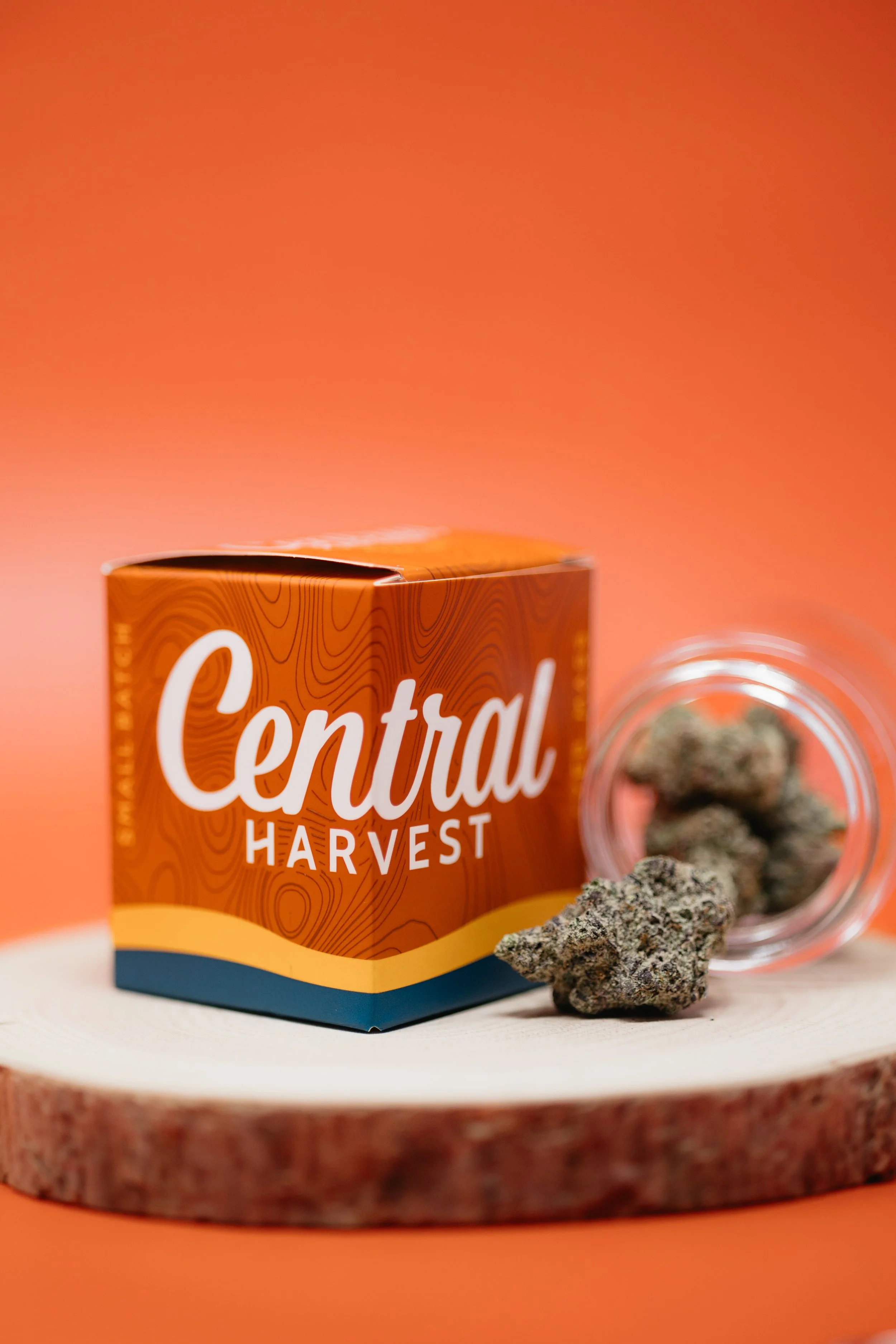
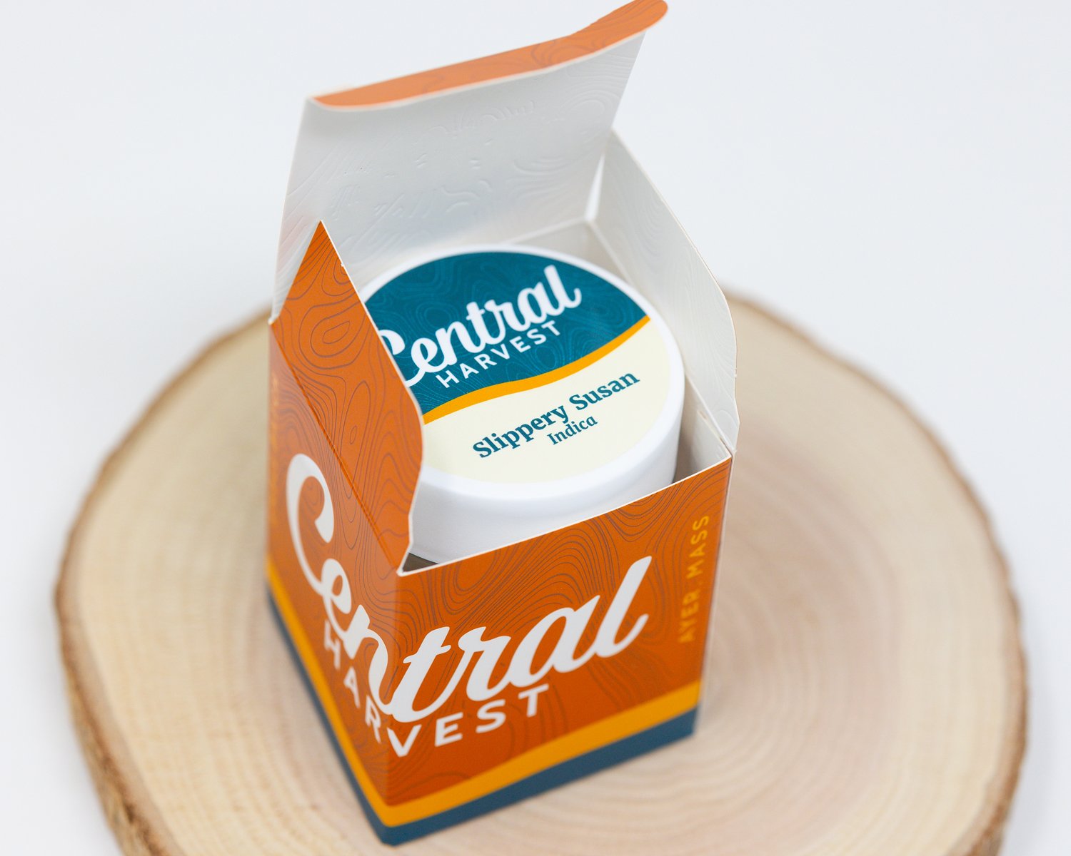
The team at Central Harvest started a marketing initiative to rebrand, rebuild, and reset their business by telling a meaningful story that recalibrates the cannabis segment, and resonates with consumers. The tip of the spear for the team was a total brand refresh, followed by a redesign of their packaging system.
Following a well written creative brief, we got to work on developing a brand that was approachable and attractive, without being over the top. The design had to look premium but more importantly break the stigma of stoner culture. In a sense we needed to normalize cannabis through the design, communicating the elevated experience similar to enjoying an espresso or fine wine.
The attributes that needed to come through were heavily influenced in coffee culture. When you purchase a coffee from your local barista you want to feel that the flavor and experience will be worth the $5 you’re spending. In addition, we all like the feeling of supporting a local small business, knowing that sense of fulfillment is being extended beyond the four walls of the business. So the design for Central Harvest had to foster a home-grown culture by being relaxed and approachable, while appealing to the consumer that appreciates investing a few extra dollars knowing they’re getting quality and in the end is excited to try it.

Thank You
We hope you enjoyed the creative but a visit to Central Harvest is definitely better. So head out to Ayer, MA to visit our friends at their dispensary and get the education of a lifetime.


