Time & Materials Beer Company Logo Design
We were tasked with designing the logo for an up and coming brewery in Boston, MA. Over the course of a few months we worked with the team at Time & Materials Beer Company to come up with a mark that would help move their brand forward as they continue to serve amazing beer out to their fans.
The objective for the project was to create a logo that they can build brand equity around while being clean, interesting, readable and memorable. The overall brief was short and to the point (just the way we like it), but only because T&M knew exactly what they wanted. Their target market was the session craft beer drinker who has a quick wit while not taking life too seriously. That went right along with their mission statement, “decent beer for everyday people”. No fluff, no marketing speak, just straight at us.
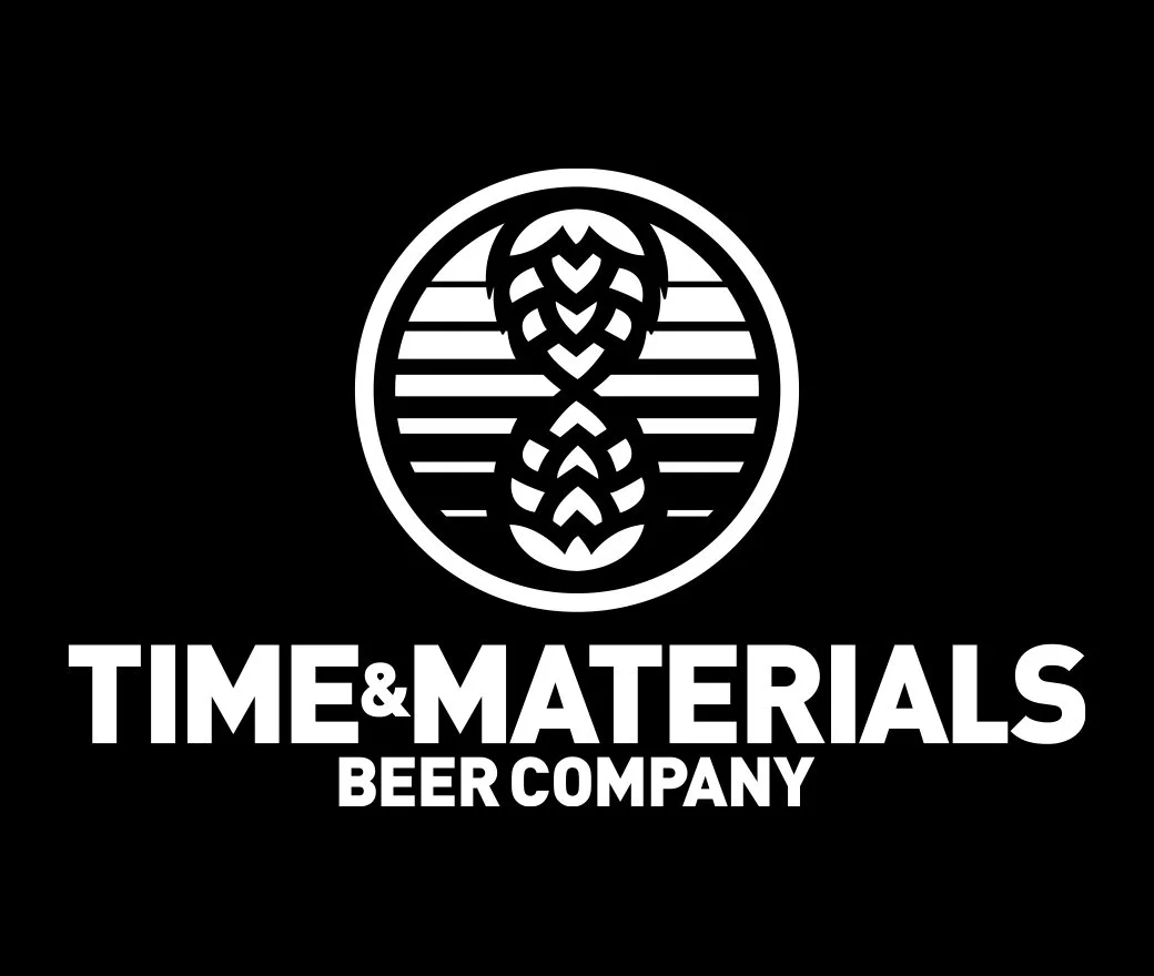
The result is a uncomplicated, defined logo that is not only memorable but as you’ll see quite versatile. It features hop cones meeting end-to-end to form an hourglass encased within a circle who’s canvas displays gradating lines. The overall meaning is the passing of time which is a pillar to the story behind the name.

Thank You
We hope you enjoyed the creative but the beer is always better, so find any one of the amazing styles made by Time & Materials Beer Company today!


